
Context
Short videos, on news websites
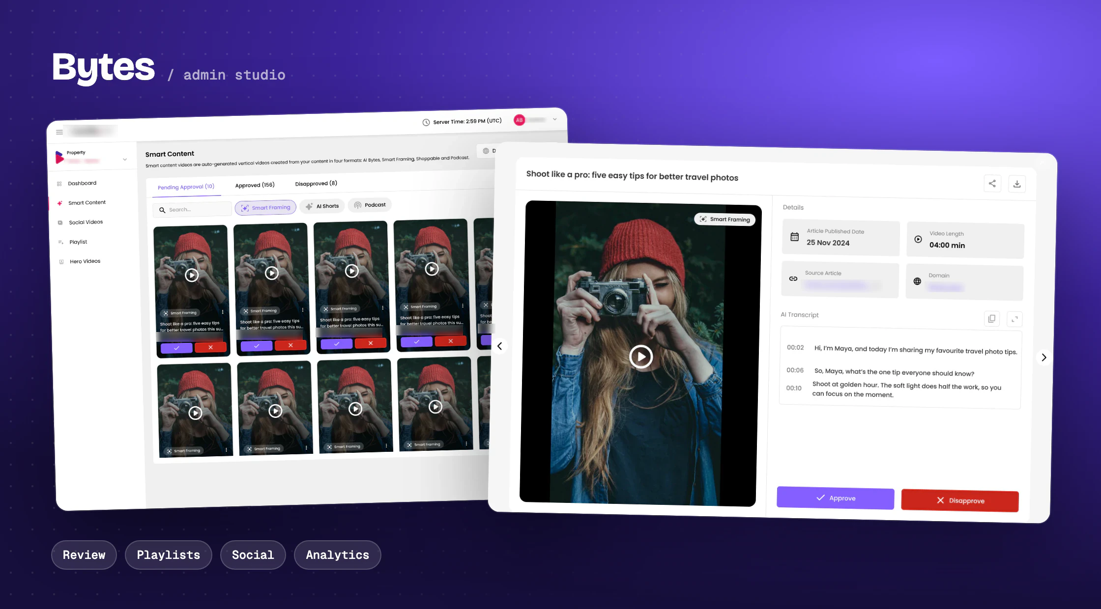
People scroll short vertical videos all day on social apps. Bytes brings that format to news and lifestyle websites: AI turns a website's articles into short videos, the videos the site already posts on social media are pulled in too, and they all play in video players on the site's pages, with ads in between. Those ads are how the website earns from the videos.
In the ad business, a website like this is called a publisher. Publishers needed one place to manage all of it. That place is the admin studio, and I designed it.
Short vertical videos the AI makes from articles, in four styles: AI Bytes, Smart Framing, Shoppable and Podcast.
Videos from the website's own Instagram, TikTok and YouTube.
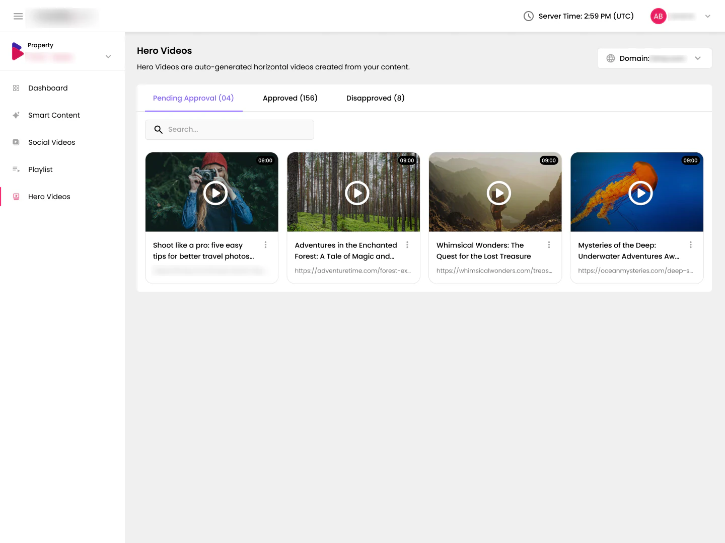
A wide video made for the top of an article, with a vertical version too.
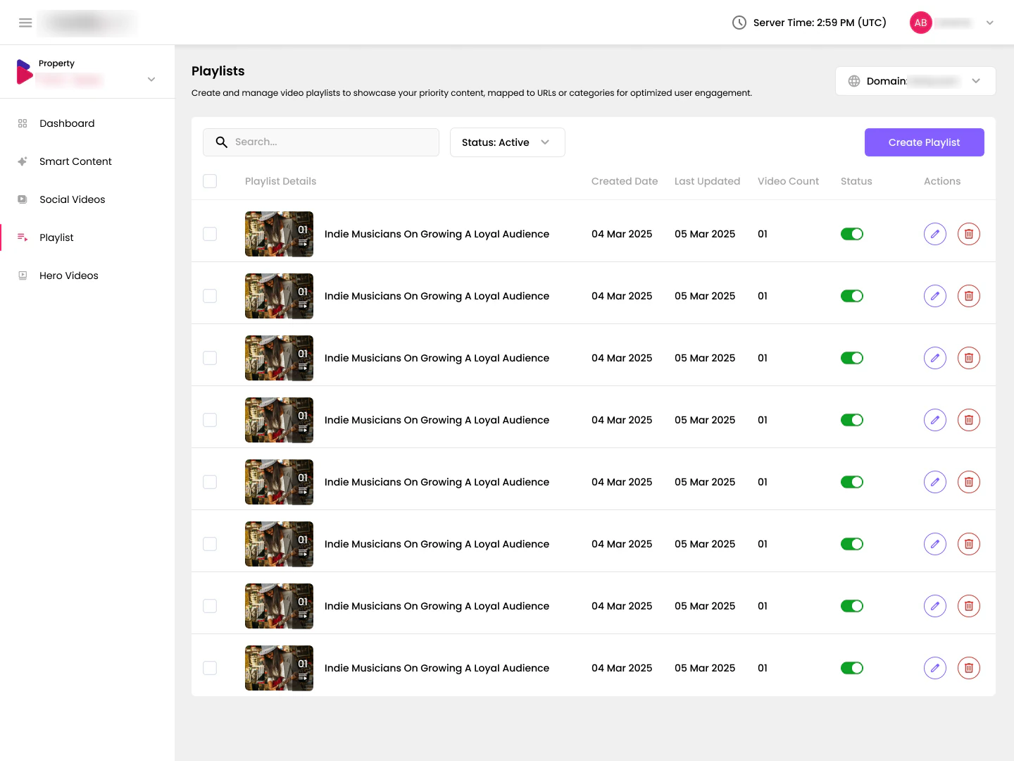
Sets of videos assigned to pages or topics, so each page plays the right ones.
The problem
AI makes the videos. The publisher's name is on every one.
A newsroom can publish dozens of articles a day, and each one can become several videos. That is a lot to check, and editors are already busy. But nothing generated by AI should reach readers without a human saying yes: one wrong caption or a bad crop is a brand problem for the publisher.
- Review had to be fast enough to keep up with the newsroom
- Every decision needed enough context to be made with confidence
- Publishers wanted to choose which videos show where
- The teams who sell and run the ads needed to see what the videos earn
Let a busy editor approve a day's worth of AI-made videos in minutes, without losing control of their brand?
Want to clear the queue quickly and never miss a mistake.
Want the right videos on the right pages.
Want to see how much people watch, and what each video player and video style earns.
Principles
Four rules I designed by
Nothing goes live without a yes. Every generated video waits in Pending Approval until someone approves it.
Judge on the card, confirm in the detail. Approve and disapprove sit on every card; the full review view is one click away.
Do it in bulk. Select many videos and act on them together, with clear feedback when it is done.
One pattern everywhere. Smart Content, Social and Hero Videos share the same tabs, cards and actions.
Reviewing videos
A queue that works like an inbox
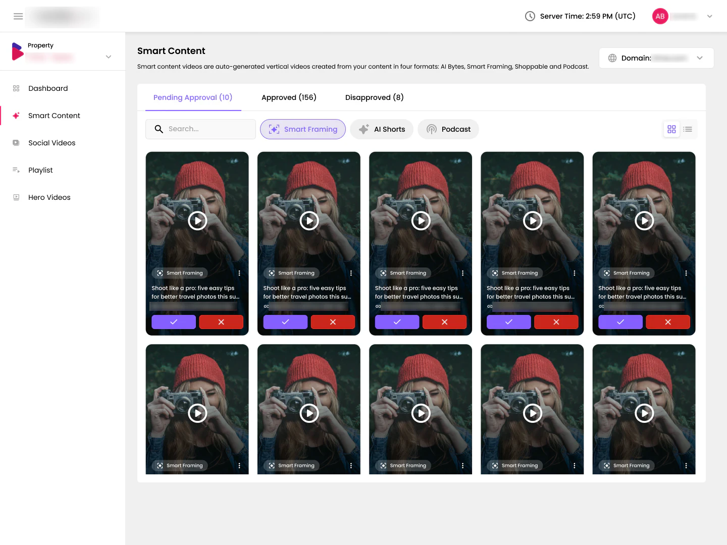
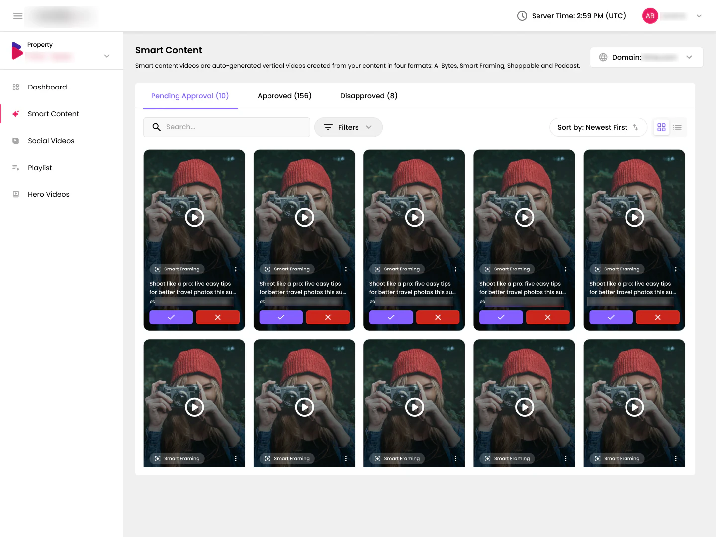
Every kind of video opens on the same tabs: Pending Approval, Approved and Disapproved, with counts so editors always know how much is left. The grid shows videos the way readers will see them, vertical and full-bleed, with approve and disapprove right on the card. Filters for each video style, and a switch between the publisher’s websites, narrow the list.
A list when titles matter more
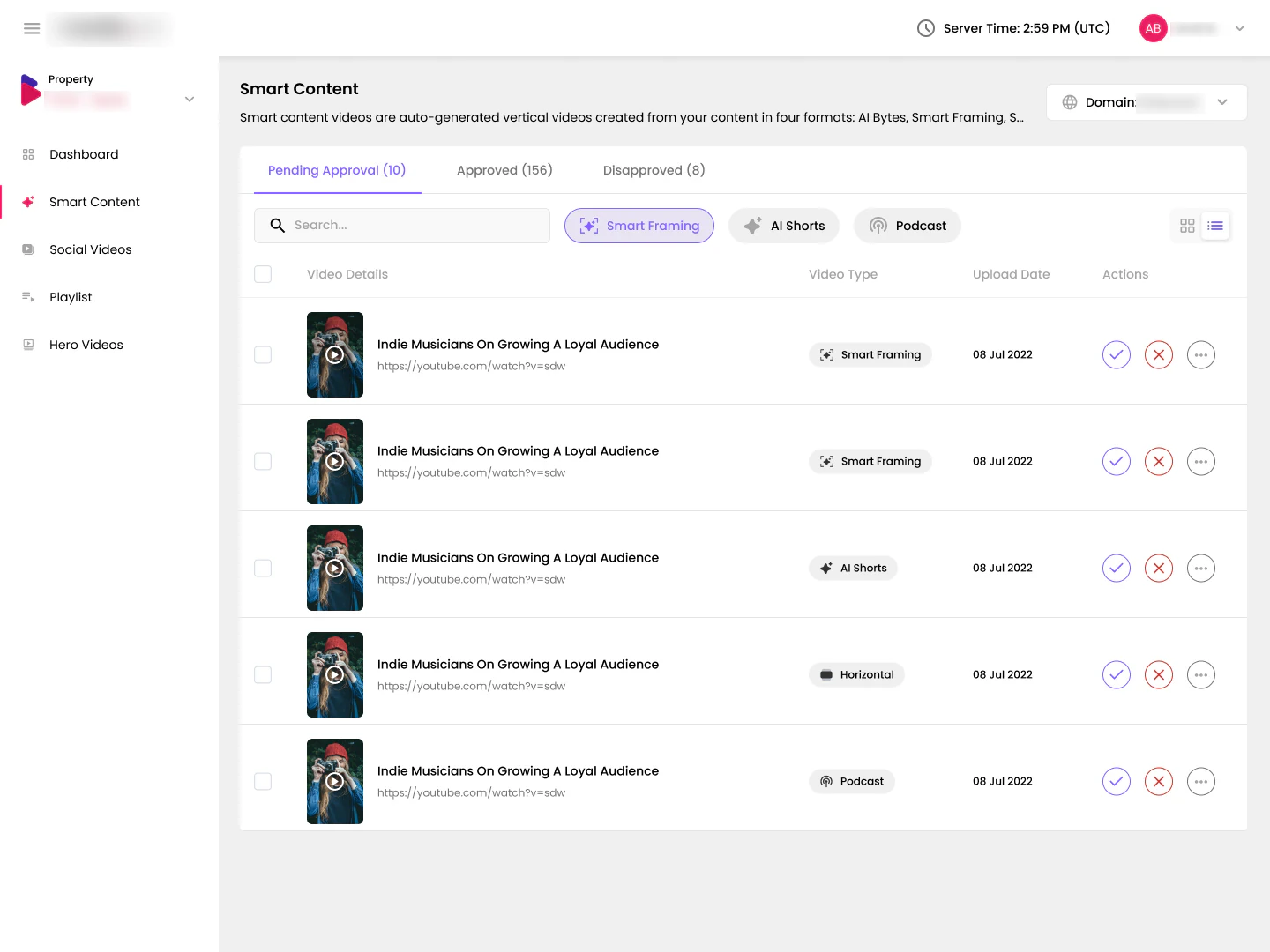
The grid is for judging visuals. A list view swaps in for scanning titles, sources and dates, with the same actions on every row.
Enough context to decide in one look
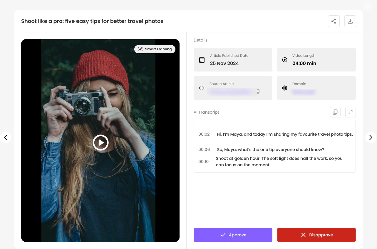
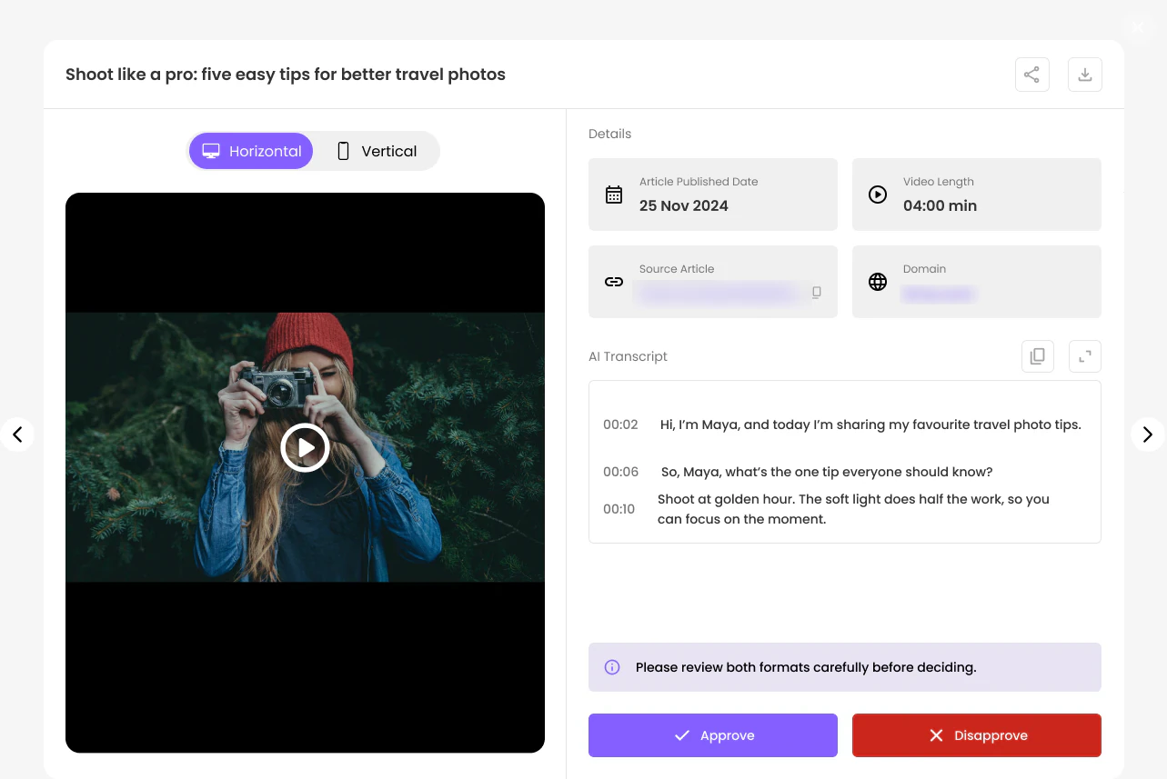
Clicking a card opens the review view. The video plays on the left; on the right sit the article it came from, its publish date, length and website, plus an AI transcript with timestamps, so an editor can check every word without watching the whole clip. Arrows on either side move to the previous or next video without closing anything, and share and download sit in the header.
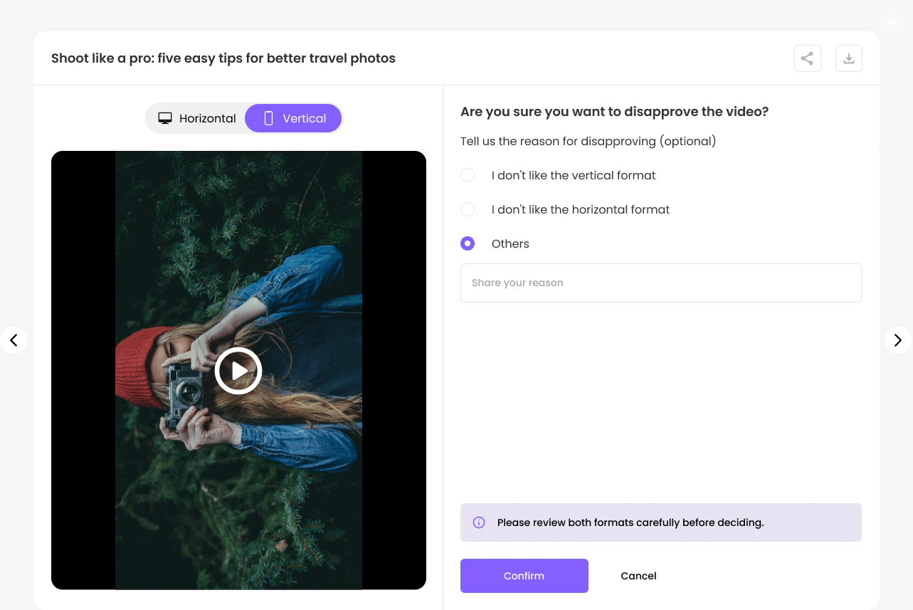
Saying no, and saying why
Disapproving asks for a reason, but never forces one. The reasons are there to improve the videos generated next, so each "no" becomes useful feedback. Hero videos come in two shapes, so the review view lets editors switch between wide and vertical, with a reminder to check both before deciding.
Bulk actions
Clear the queue in one go
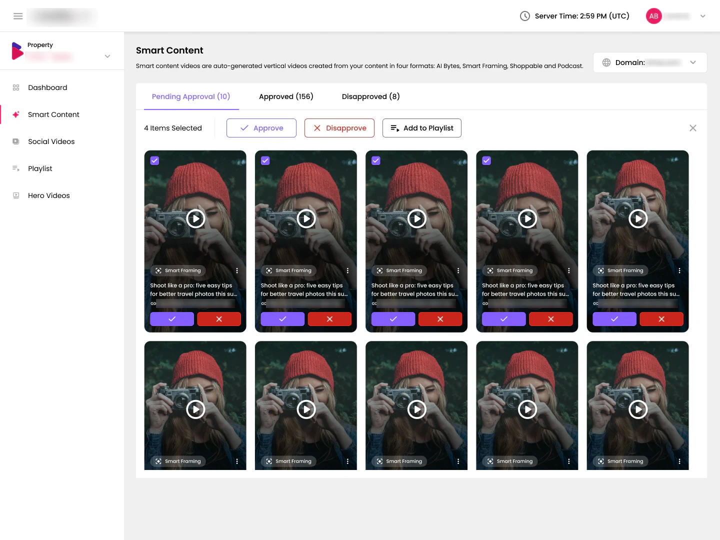
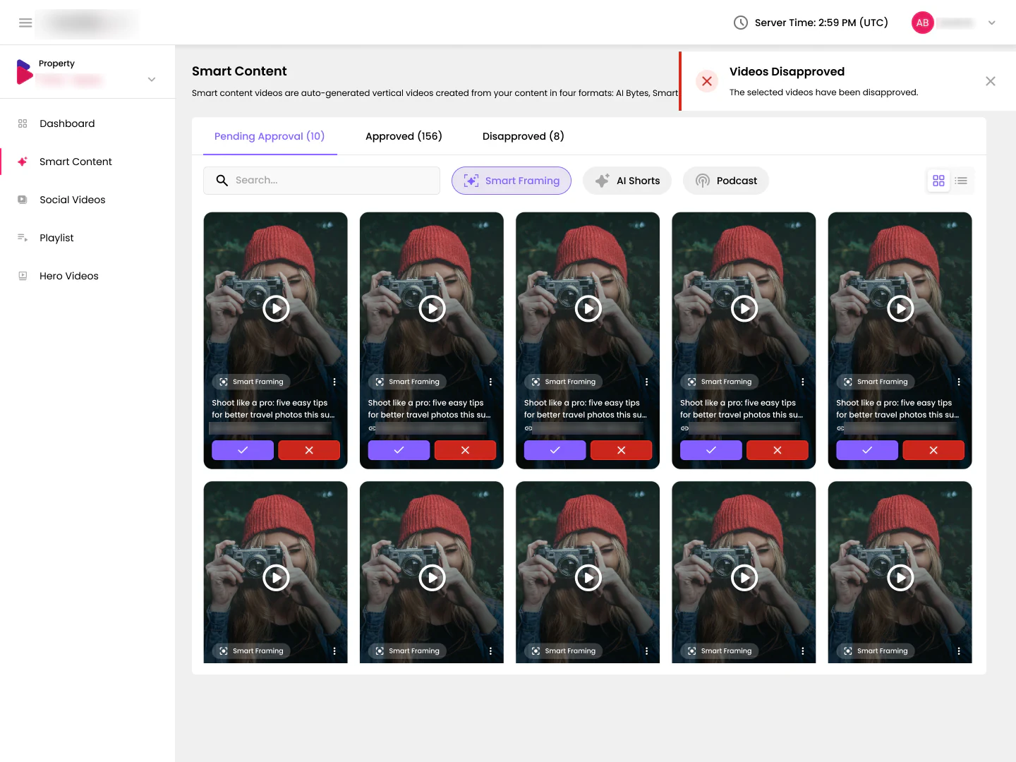
Selecting cards swaps the filter bar for a selection bar with a count: Approve, Disapprove or Add to Playlist, and a quick way out. Every action ends with a toast that says exactly what happened, so people know it worked without checking each card.
Playlists
The right videos on the right pages
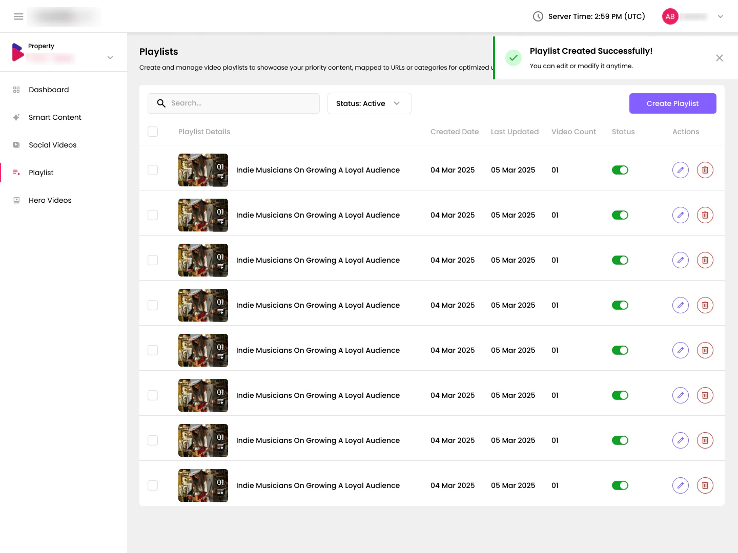
Playlists group videos and assign them to pages or topics, so a food article shows food videos. Each row shows the cover, video count and dates, and a status toggle lets teams switch a playlist off without deleting it.
Picking videos
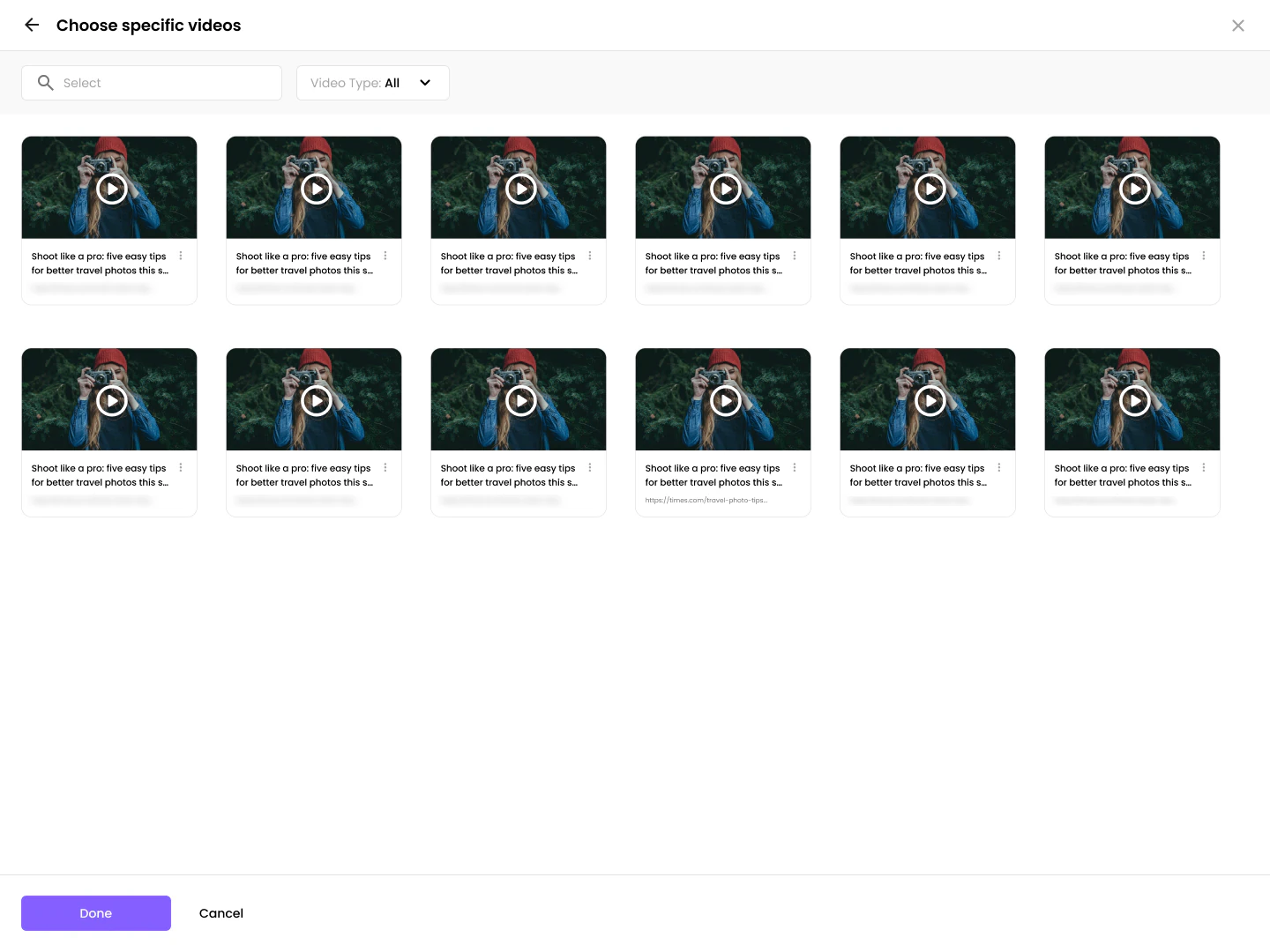
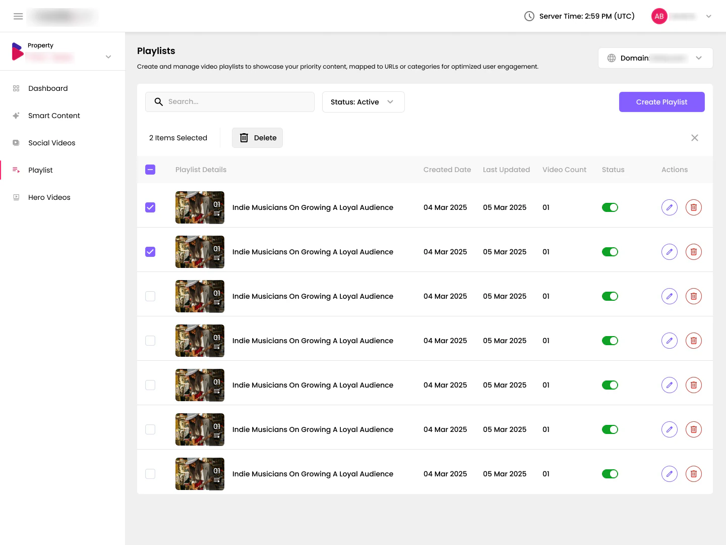
Creating a playlist opens a full-screen picker to choose specific videos, with search and a video-type filter. Selecting playlists brings up the same selection bar as the queue, and every change is confirmed with a toast.
Dashboard
Showing what the videos earn
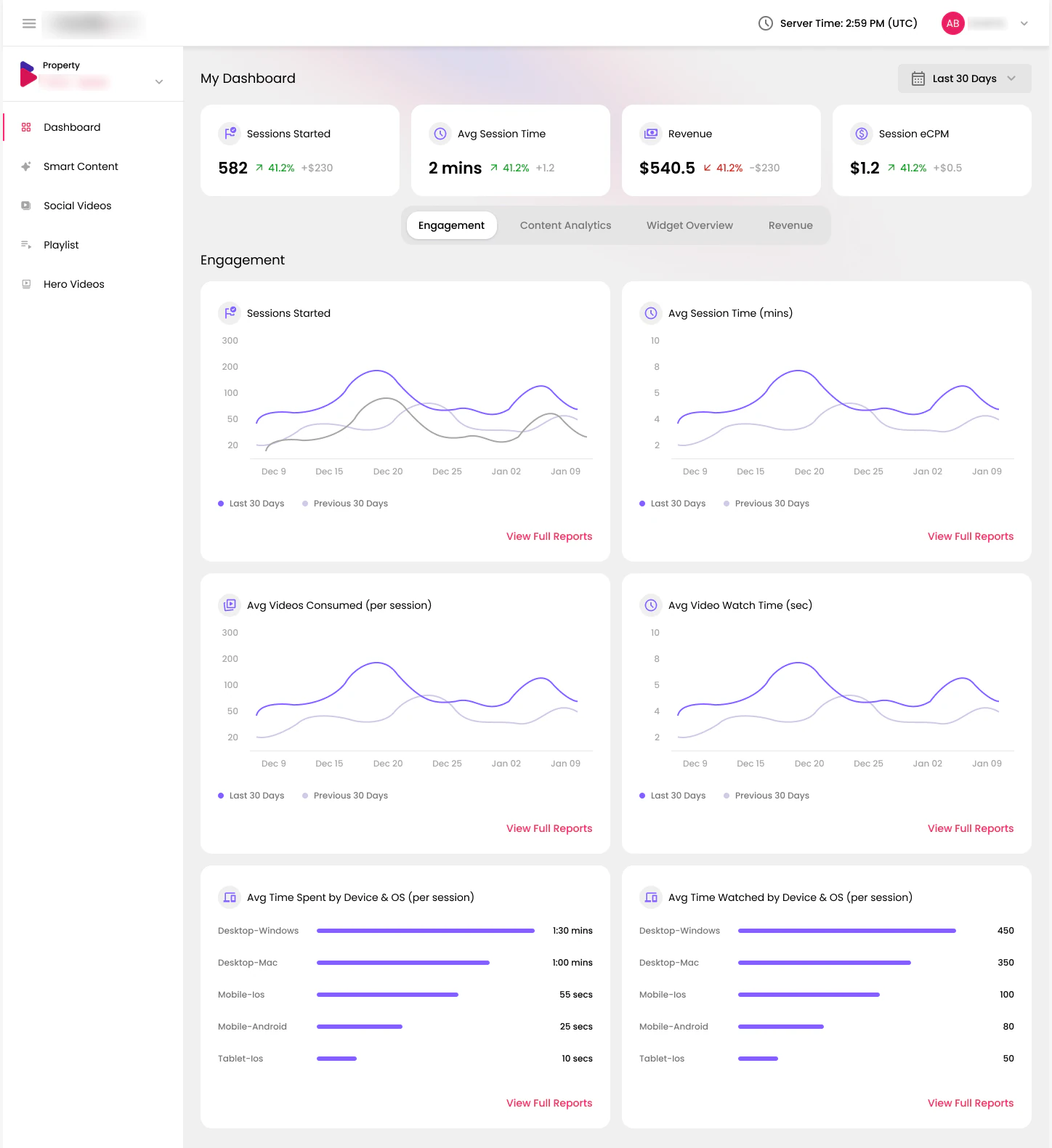
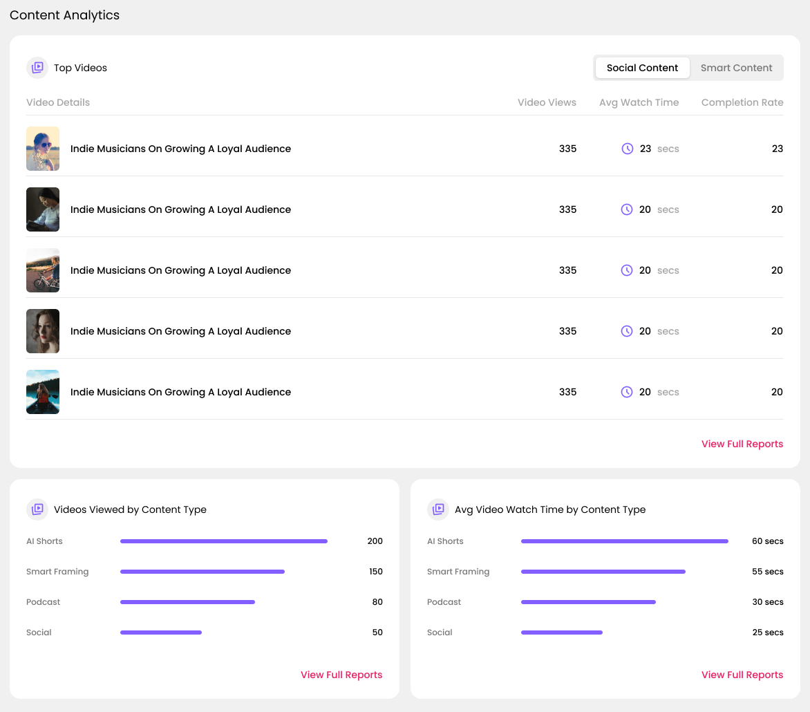
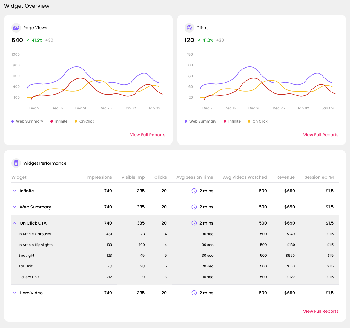
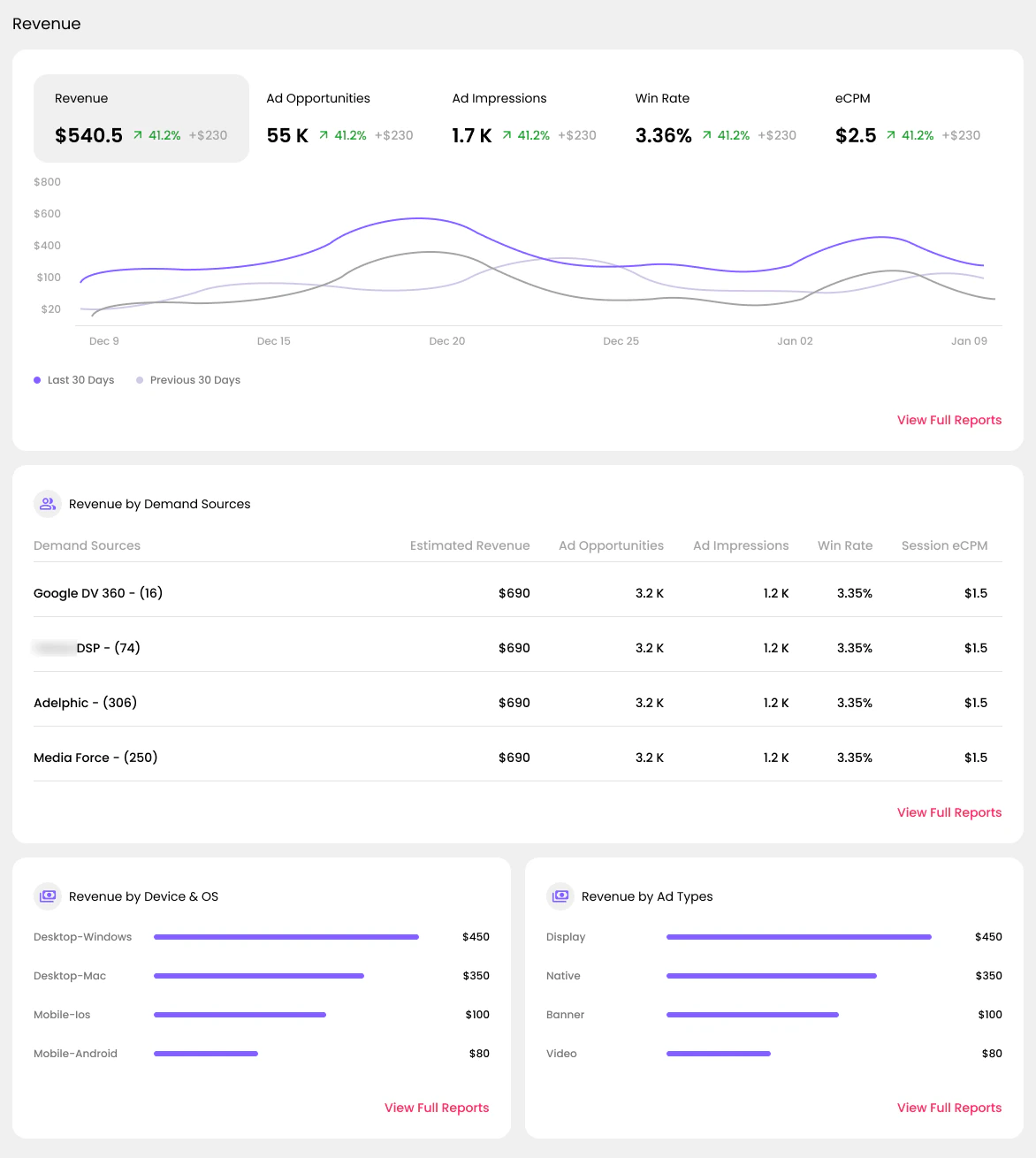
The dashboard answers three questions: are people watching, which video styles work, and which video players on the site earn the most. Every number is compared with the previous period, and the page reads top to bottom: Engagement, Content Analytics, Widget Overview and Revenue. A widget is a video player placed on a page, and each widget row expands to show every player of that kind.
Design system
Built from one set of parts
Smart Content, Social and Hero Videos work the same way, so they are built from one set of building blocks: tabs with counts, style tags, review cards, approve and disapprove buttons, selection bars, confirmation messages and row actions. Adding a new kind of video is mostly a matter of reusing these parts.
Iterating on filters
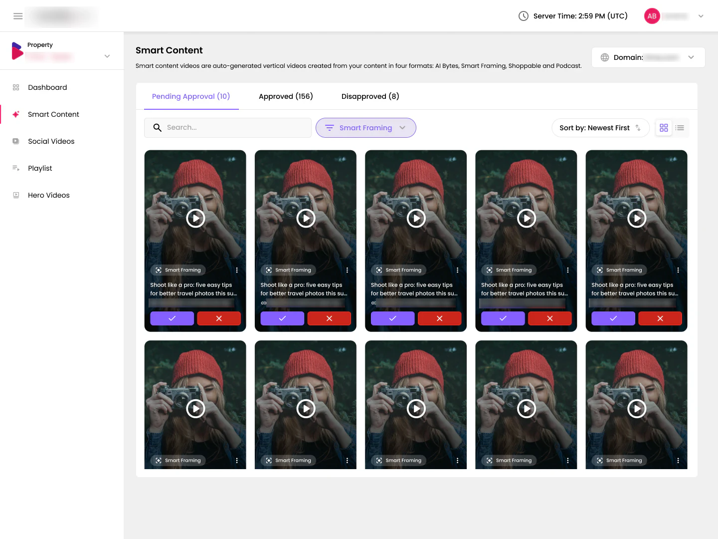
Early versions had one button per video style. As the styles kept growing, a row of buttons stopped fitting, so I explored a single Filters menu with sorting next to it. When a filter is applied, the menu shows it, so the state is never hidden.
What I learned
Designing for trust in AI content
The transcript and source details did more for review speed than any shortcut. People decide faster when they trust what they see.
Optional reasons on disapprove turn rejections into feedback that improves the next videos the AI makes, at almost no extra effort for editors.
One way of reviewing across every kind of video meant new styles slotted in without new screens to learn.
Video thumbnails in these screens are royalty-free photos from Unsplash by Benjamin Combs, Lechon Kirb, Jon Ottosson, Danka & Peter, Marat Gilyadzinov, Alexander Shustov, hieu le, Abigail Keenan, Roksolana Zasiadko and Roberto Nickson.
Social videos
Bringing in what they already post
Social videos come from the publisher's own channels, so they arrive approved but can still be pulled at any time. Filters for Instagram, TikTok and YouTube keep each channel separate, and the list shows where every video came from.