Context
A growing product, one set of parts
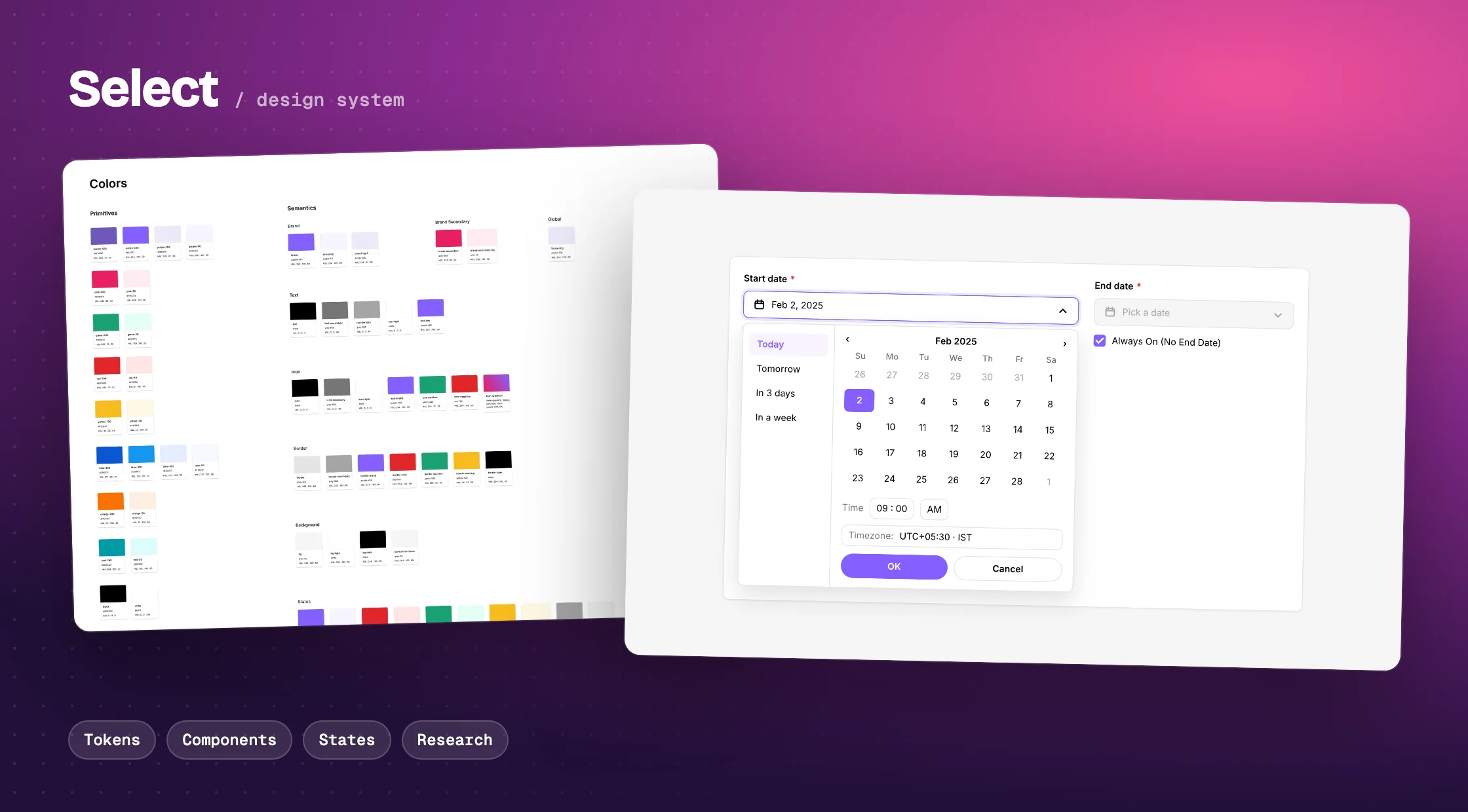
Select is a B2B platform at Media.net where curators put deals together. It was growing quickly, and moving from an older internal interface to a brand of its own.
I built the Select Design System so every screen is made from one shared set of tokens and components, and so a problem fixed once is fixed everywhere.
Colour, spacing, radius, border, icon and size tokens, 42 text styles and 3 shadows.
24 component pages, from buttons and inputs to date pickers and segment builders.
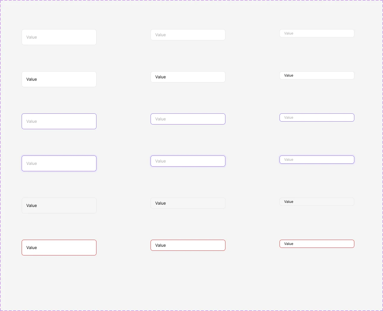
Default, hover, focus, selected, disabled, error and loading, documented on each page.
A sync sheet that lists every token with its value, for design and engineering.
The challenges
The problems lived in the components
Before changing anything, we watched people use the product. In February and March 2025 we ran three sessions on the main creation flow: two curators doing the task while we timed them, and feedback from the sales team. Names stay private.
What surprised us was where the problems sat. They were rarely about the flow. Most were about how a single component behaved, and every screen that used it had the same problem.
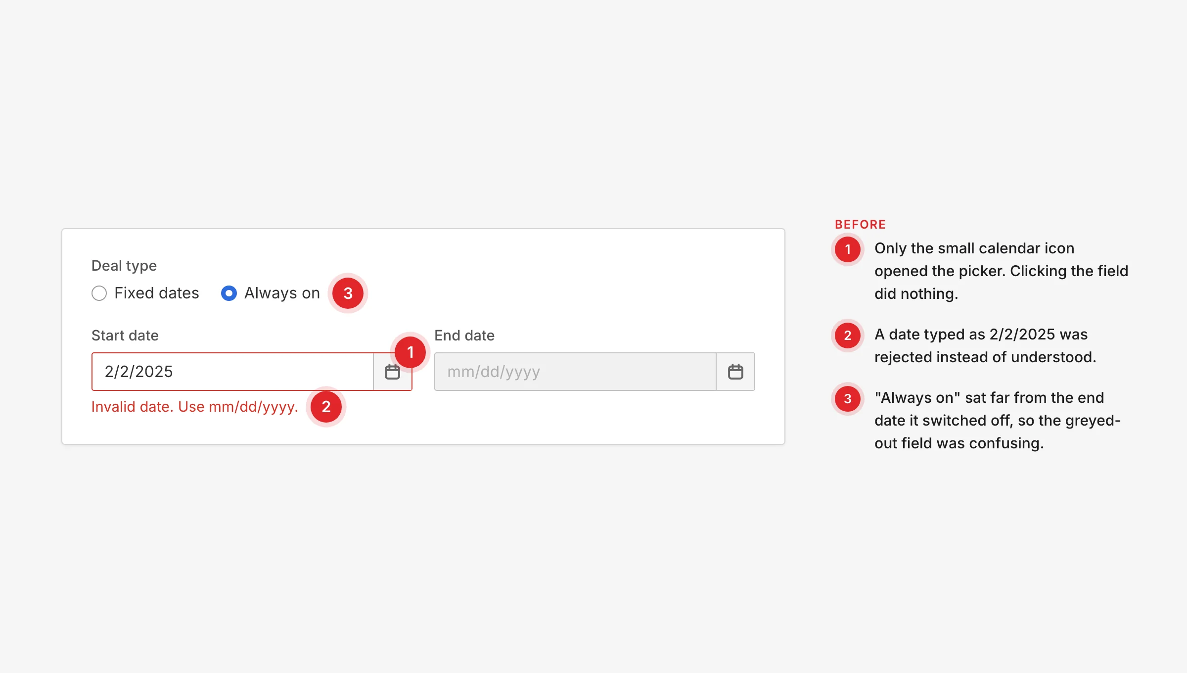
Dates fought back. Only the calendar icon opened the picker, and a typed date like 2/2/2025 was rejected.
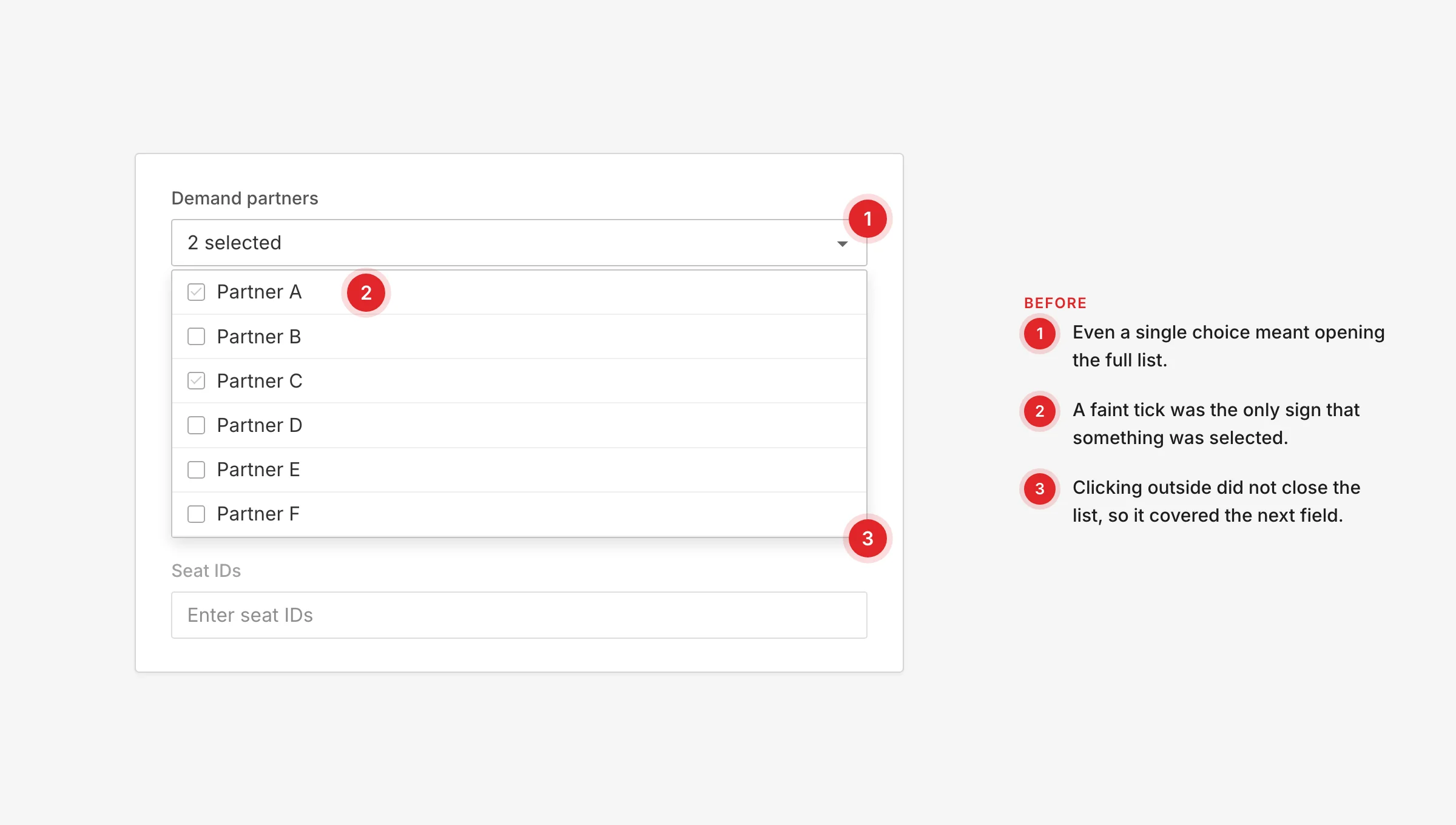
Dropdowns for one click. Even one choice meant opening a multi-select, and it did not close when clicking outside.
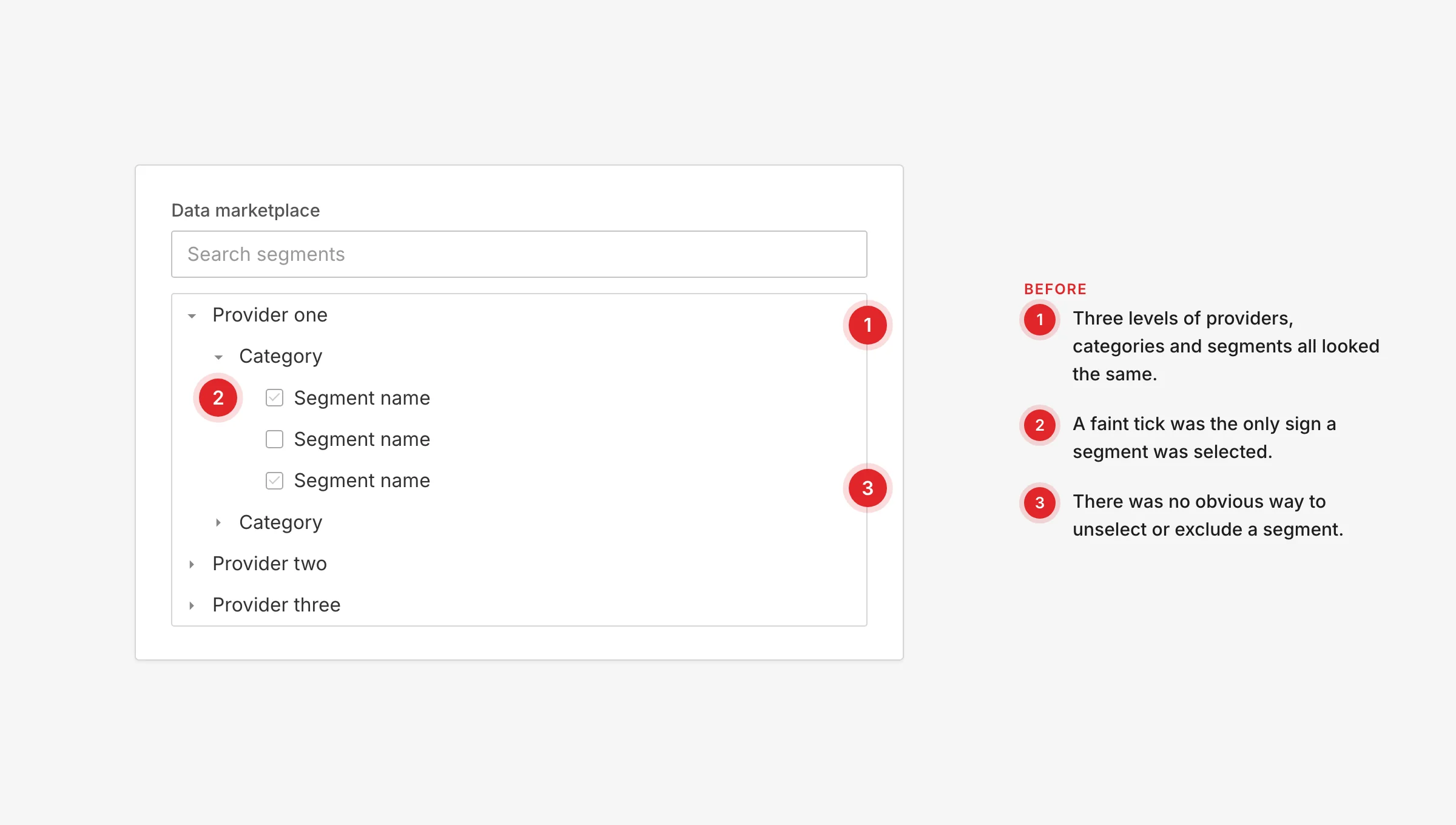
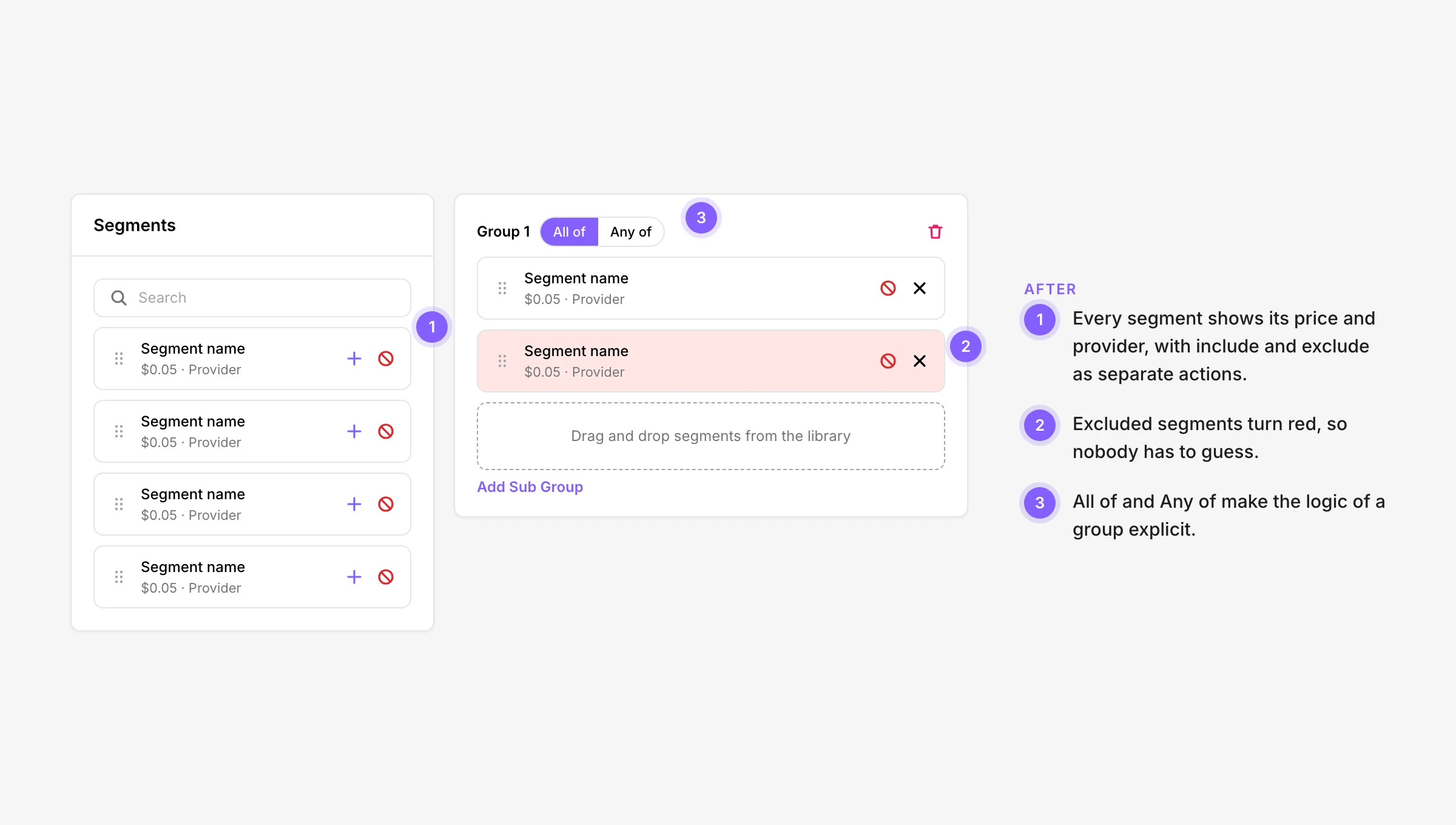
Selected, or not? A faint tick was the only sign of a selection, and there was no clear way to undo it.
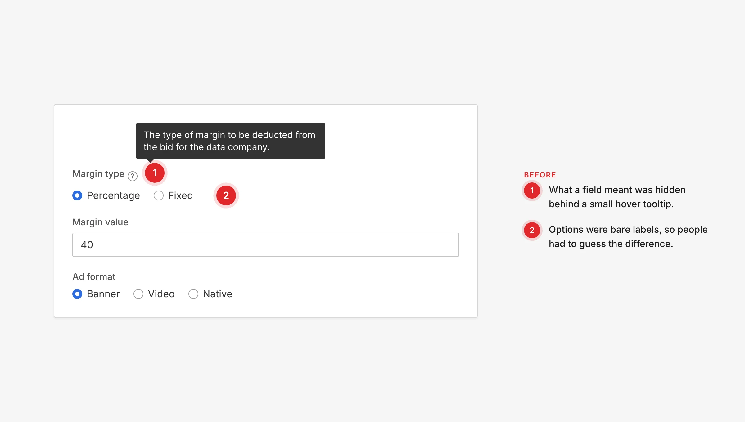
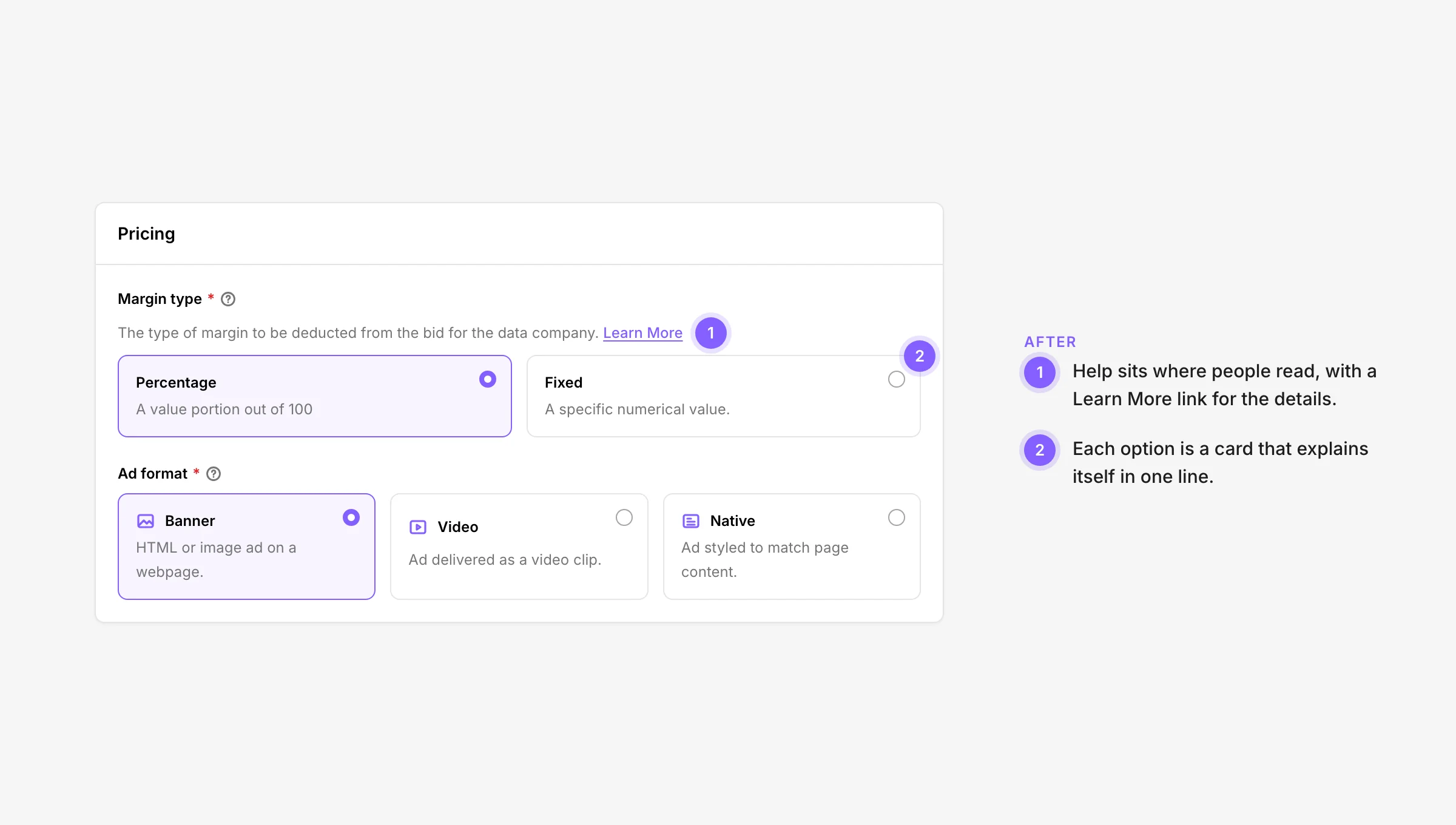
Meaning was hidden. Field help sat behind small hover tooltips, and options were bare labels.
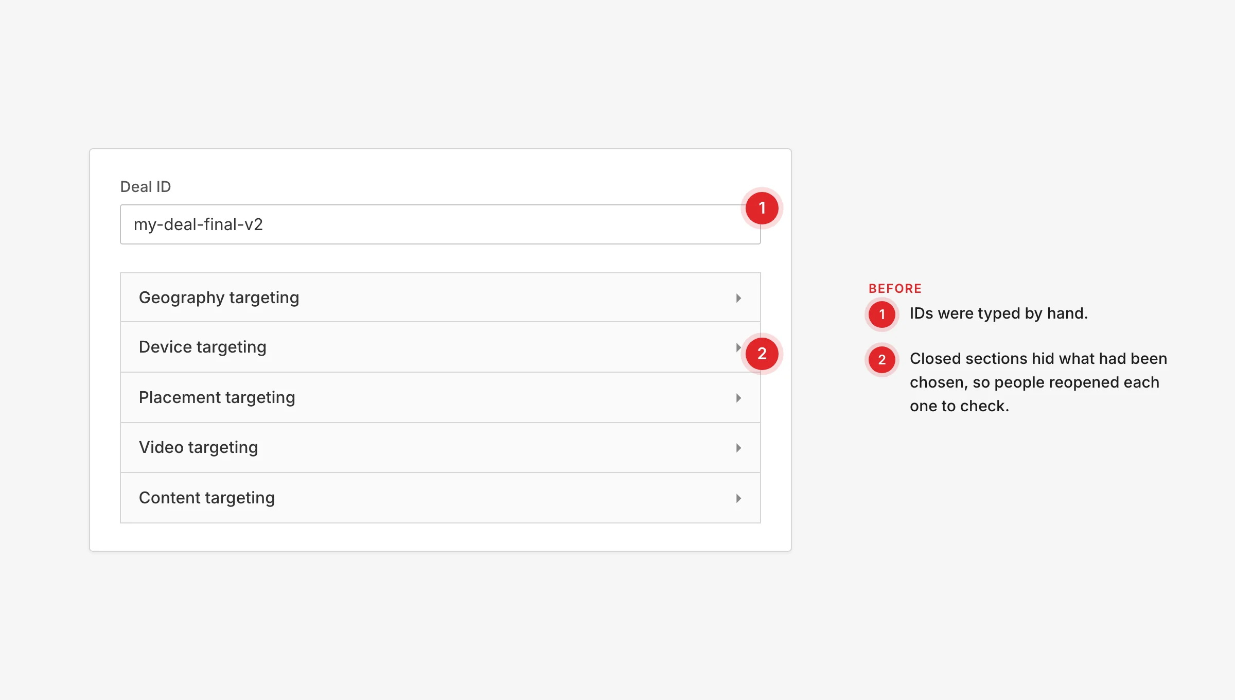
Choices disappeared. Closed sections hid what had been picked, so people reopened each one to check.
Busywork. IDs were typed by hand, and a setting in one place silently disabled a field in another.
Fix each problem once, in the component, so every screen that uses it gets the fix?
Foundations
Tokens first
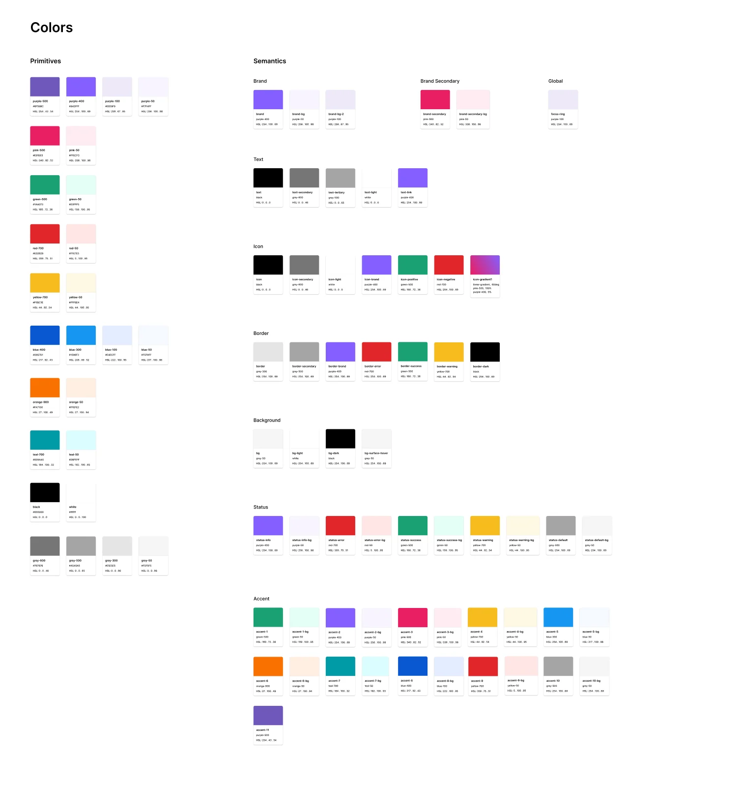
Everything starts from two layers of variables. Primitives are the raw values: 26 colours and 21 spacing steps from 0 to 520. Semantics say what a value is for: 59 colour roles such as text-secondary, border-error and status-warning-bg, and 39 tokens for spacing, radius, border width, icon size and element size.
Components only use semantic tokens. A field asks for border-error, not red-700, so a colour can change in one place without hunting through every screen.
Type, and one source of truth
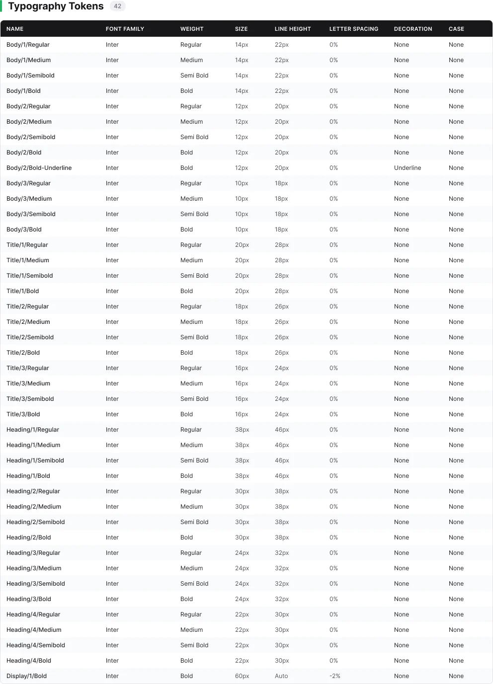
Typography is 42 text styles in Inter across Body, Title, Heading and Display, each in four weights. A sync sheet lists all 187 tokens with their values and where they come from, so design and engineering read from the same list.
Before and after
Fixing it where it breaks
Each challenge pointed at a component. For each one I rebuilt the component with every state documented, so the fix travels with it into every screen. Switch between Before and After on each example.
Dates
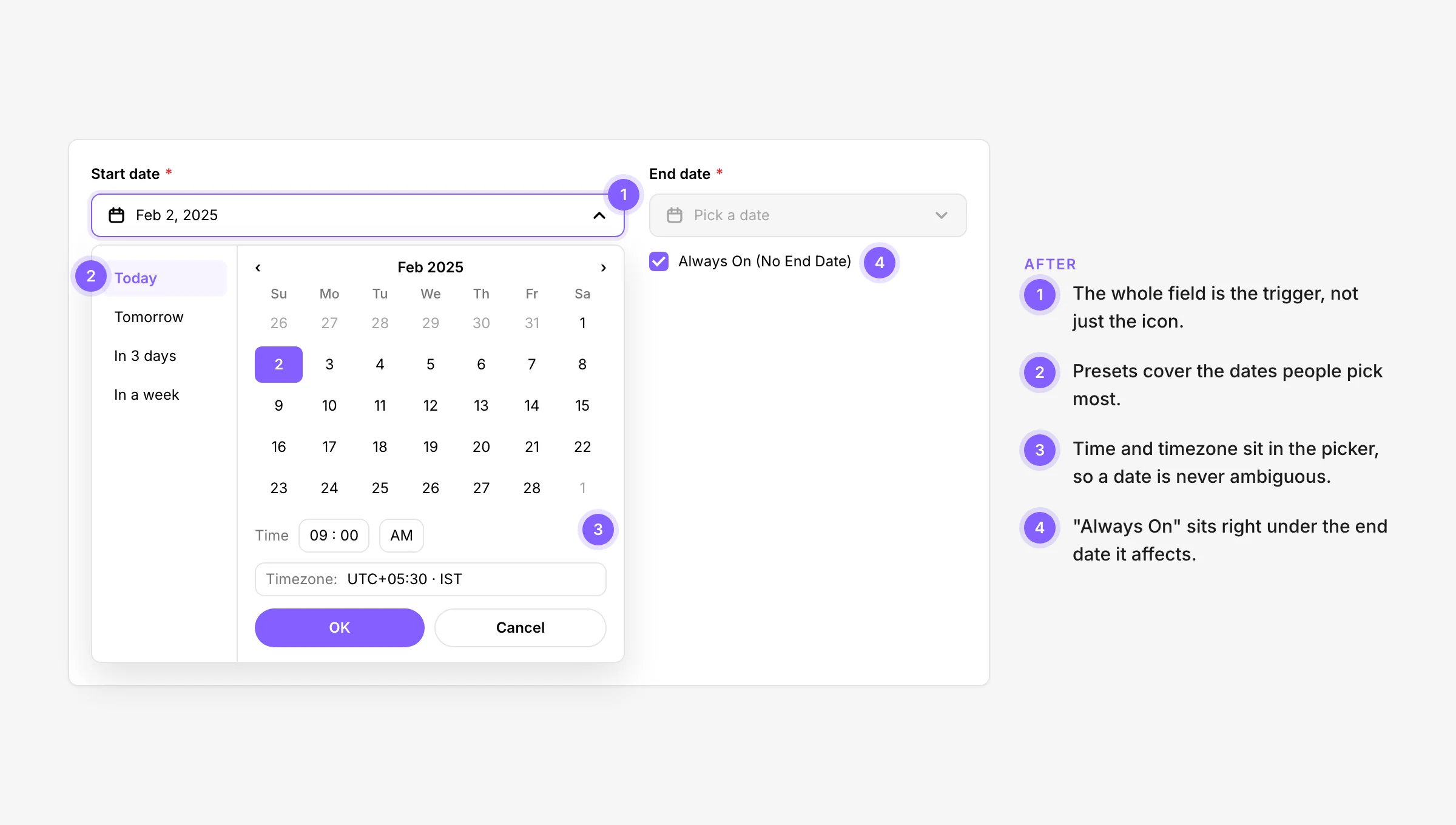
Before, only the icon opened the calendar, a typed date was rejected, and a setting elsewhere switched off the end date without saying why. Now the whole field opens the Date Picker, presets cover the common dates, time and timezone are built in, and "Always On" sits right under the date it affects.
Multi-select
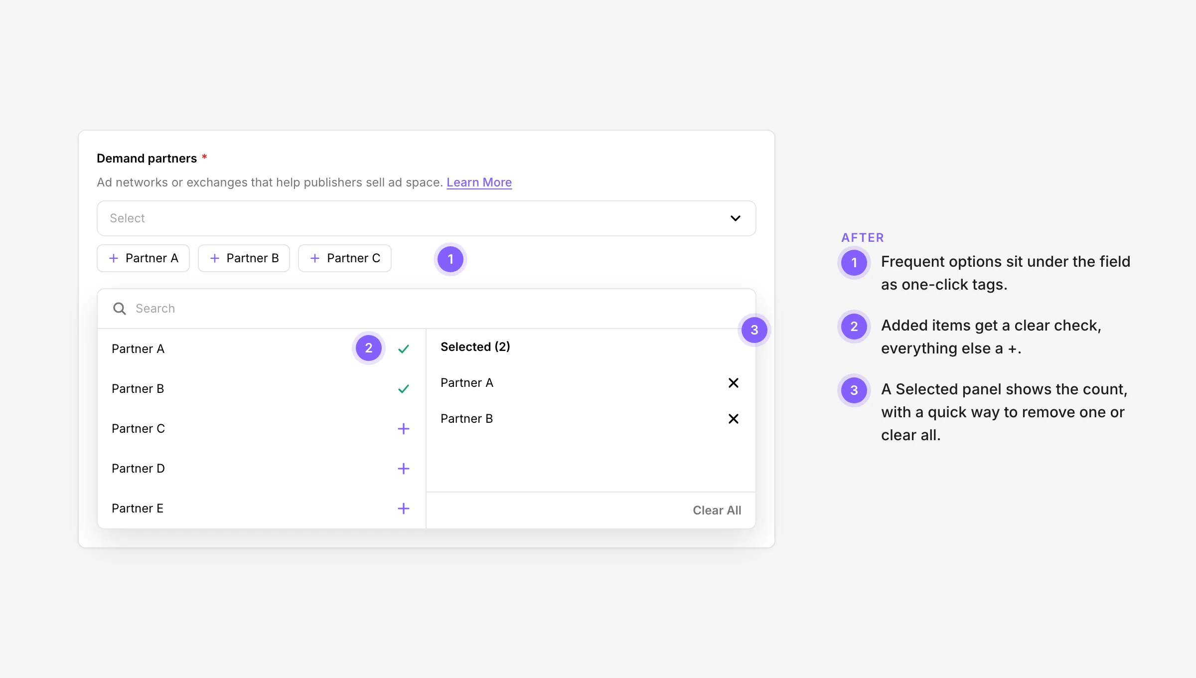
Before, every choice meant opening a long list with faint ticks that stayed open. Now frequent options sit under the field as one-click tags, items are added with a clear + and check, and a Selected panel shows the count with Clear All.
Options and help
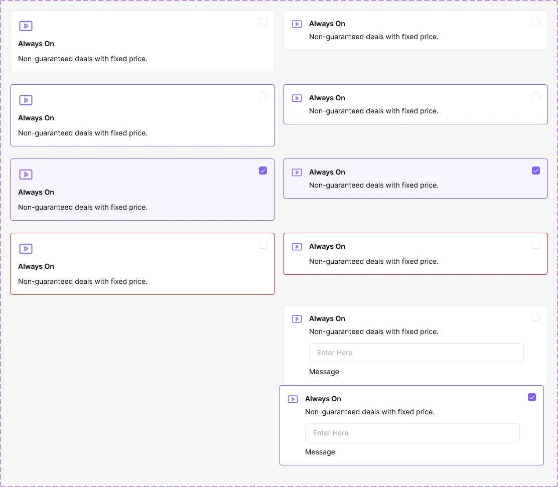
Before, the meaning of a field hid behind a hover tooltip and options were bare labels. Now help sits under the label with a Learn More link, and each option is a card that explains itself in one line.
Segments
Before, a three-level tree made everything look the same, and a faint tick was the only sign of a selection. Now each segment is a row with its price and provider, include and exclude are separate actions, excluded segments turn red, and groups say All of or Any of.
Fields and sections
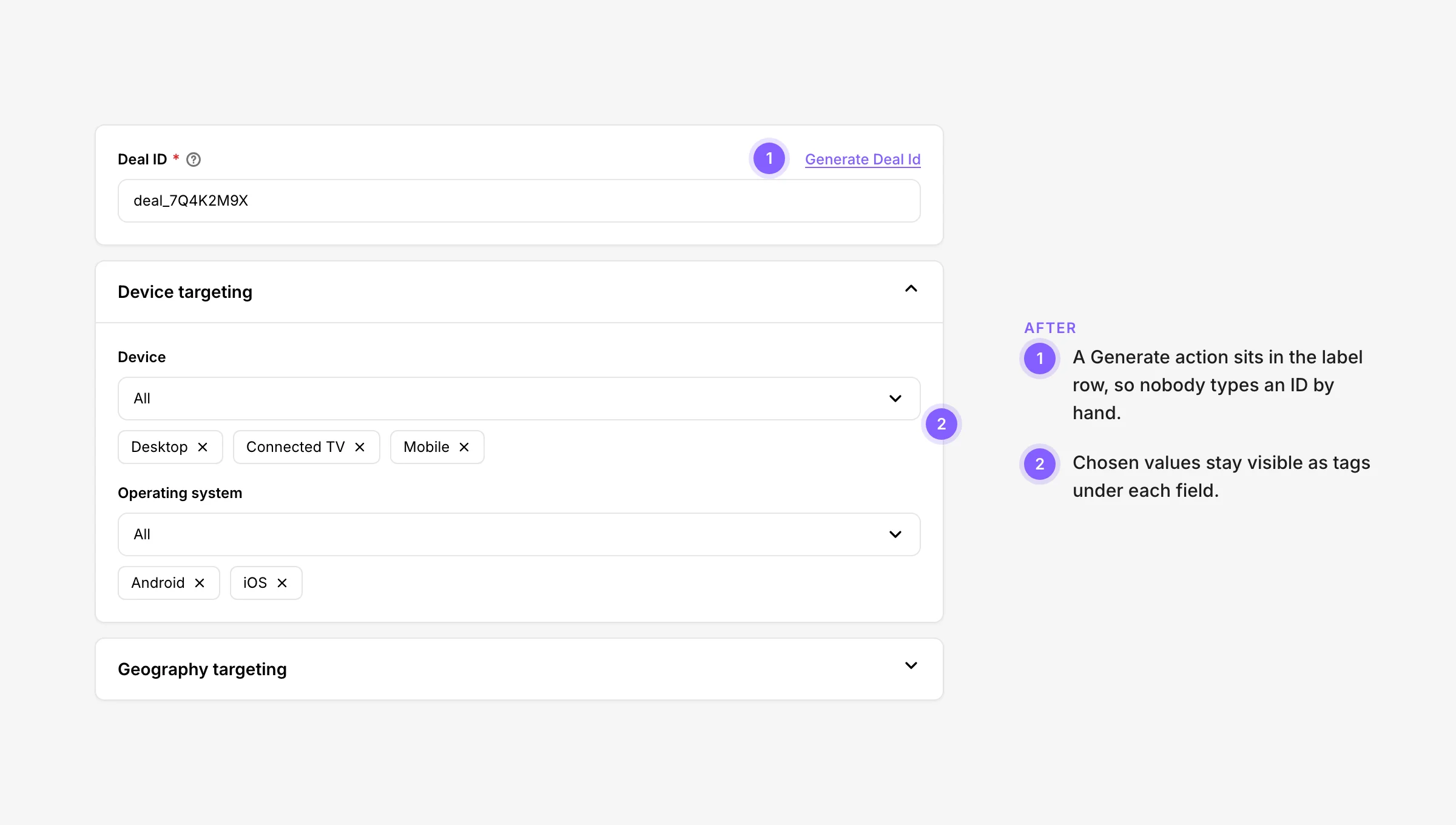
Before, IDs were typed by hand and closed sections hid what had been chosen. Now a Generate action sits in the label row, and chosen values stay visible as tags under each field.
The system
Built in layers, documented in every state
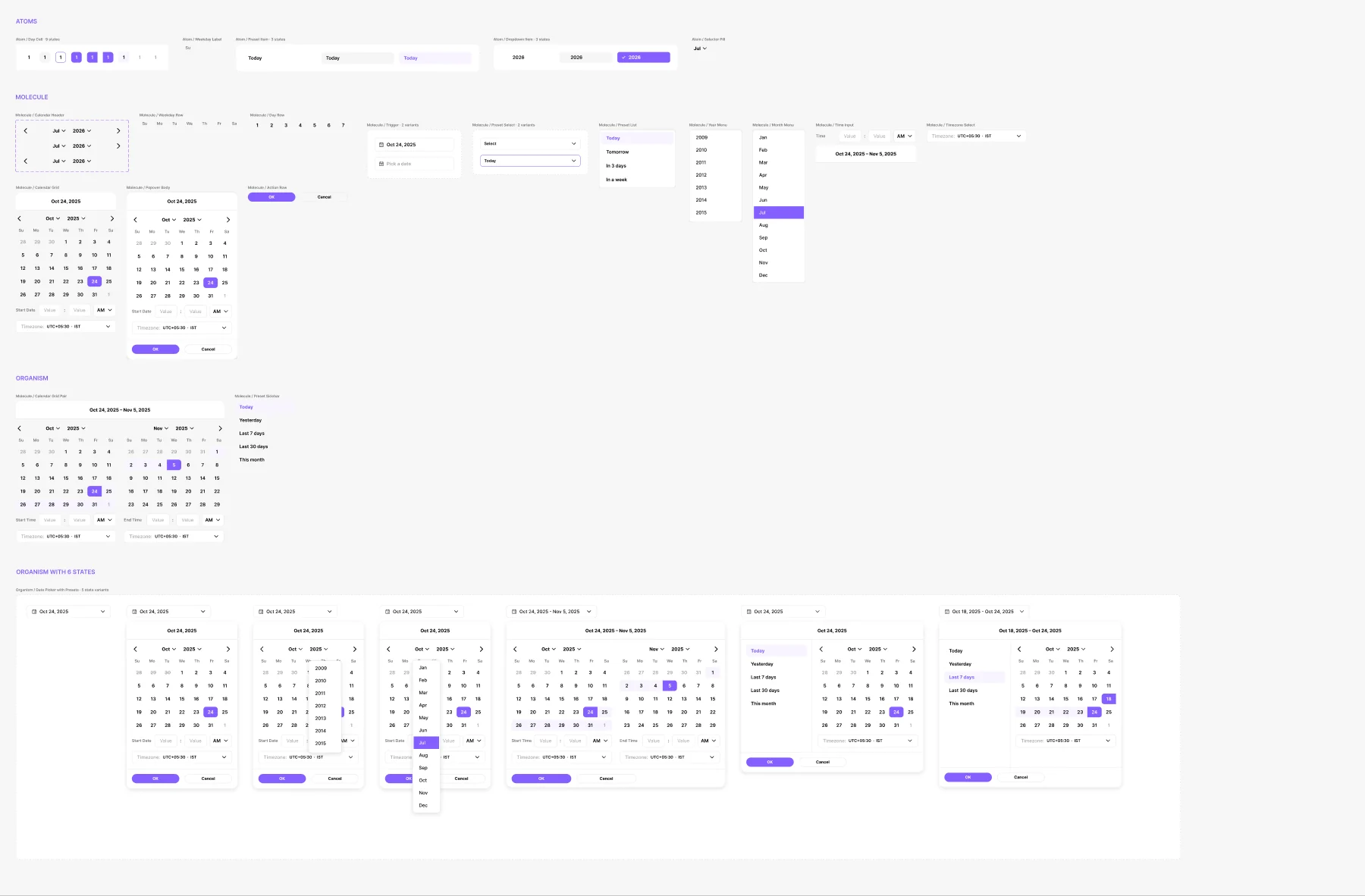
Components are built from atoms up. The Date Picker, for example, starts with day cells and preset items, combines them into a trigger, a calendar grid and a time input, and ends as a full picker documented in each state. The same approach runs through the library.
- Button
- Badge
- Card
- Checkbox
- Radio
- Switch
- Toggle
- Toggle Group
- Input
- Input Group
- Combo Box
- Dropdown
- Date Picker
- Dialog
- Tooltip
- Hover Card
- Toast
- Table
- Progress Stepper
- Progress Step
- Header & Navigation
- Widget
- Icons
- Deal Library
What I learned
Research is a component audit
People describe flow problems, but most fixes were in the components. Fixing a dropdown once fixed it on every screen.
Semantic tokens made changes safe: you change what border-error means, not every red on every page.
Documenting loading, error, selected and disabled up front is what lets new screens start from solid ground.